I recently decided to take some time to look at a few school website design ideas to get the creativity and inspiration flowing. After a few hours and a blog post later, it turns out there are some pretty outstanding candidates … and we didn’t just include all of our own Roberts Digital Website Designs! I’ve put together a list of my top 12 favourite school websites for you in this blog post so that you can get some inspiration for your site.
Whether it be simply updating a section or redesigning a new school website, these examples will inspire your creativity.
Before we get into it, what makes a school website so important in the first place? Do schools overdo it and fuss too much when it comes to website design? Actually, research has shown that parents do A LOT of their research online.
If your marketing strategy were a car, your website would be the engine because all roads point to your website in this digital age. I’ve seen too many expensive advertising campaigns lead to a poor website and we often are unaware of the loss because of it.
These are the key elements that every school website should have
Overall, they should perform these three main functions:
- School websites act as a marketing tool for prospective families and convert cold traffic into enrolment enquiries.
- School websites provide information to families and the community on your school’s points of difference, programs, and offerings.
- School websites act as an information source for what’s happening at your college, including events, news, and dates.
School Website Design Judging Criteria
What makes a good website in my eyes? For a starting point, I recently did a video on how school websites have the tendency to look cluttered and have complex navigation which results in a poor user experience, and parents not being able to find the content they are after. A great website simplifies complexity into a clean interface and user experience. I’m looking for websites that understood their audience and have a clear pathway for each audience to follow.
Of course, aesthetics play a huge role and what I saw while doing my research is that strong school websites start with strong brands. The colours, typography, and photography make the website so if these elements are not strong to start with, the result will be average. I also took a look beyond the aesthetics to weigh in on the likelihood of these websites successfully completing their task of converting prospective families into enrolment enquiries. At the end of the day, these are the top 12 websites that I feel meet all the school website design requirements.
Top 12 school website designs:
Trinity Anglican College
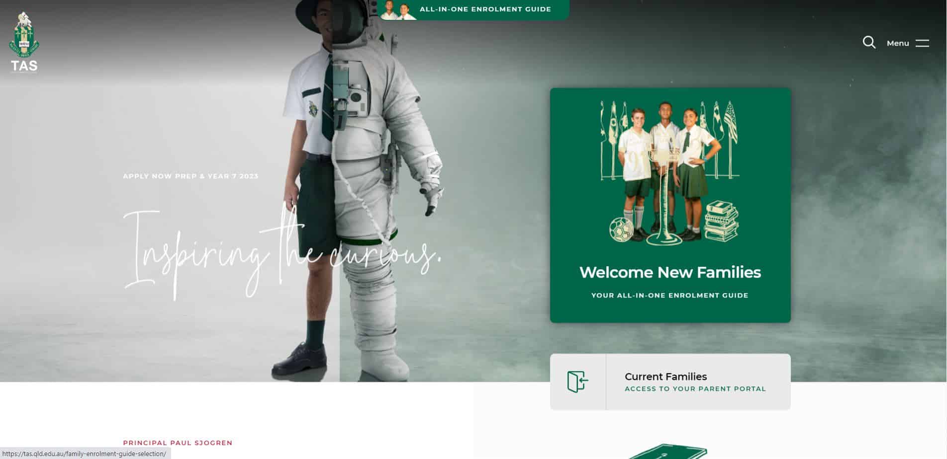
URL: tas.qld.edu.au
Trinity Anglican College is a K-12 school located in Kewarra Beach, North Queensland. Trinity has an outstanding academic reputation and proudly state that over 60% of their students achieve an ATAR score over 85.
What I loved: Trinity has adopted a truly unique website design. Incorporating assets that complement the school’s strong academic reputation and aspirations for their students. The website finds an attractive balance of positive and negative space while not overdoing or cluttering the look and feel. In addition, there is a strong emphasis on attracting new families with consistent and attractive calls-to-action. It goes without saying that Trinity has built a fantastic website with a strong emphasis on marketing to prospective families.
Mobile Friendly: Yes
Considerations for improvement: Trinity might want to consider making internal resources for current parents and students more prominent and accessible. While the website works great as a marketing tool for external families, it does so at the cost of internal usability. In addition, a third accent colour could help break up some of the consistent use of white and green.
Penrhos College
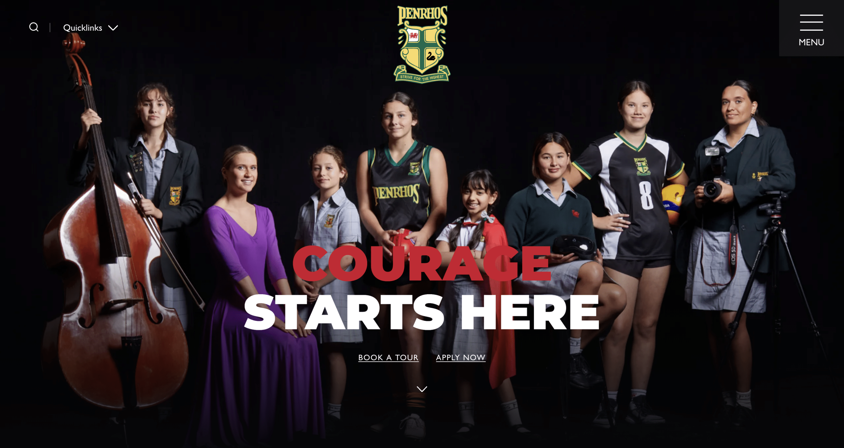
URL: penrhos.wa.edu.au
Penrhos College is an all-girls K-12 and boarding school located in Como, Perth. Penrhos is renowned for their academic reputation and commitment to their uniting church faith.
What I loved: The Penrhos website is truly a modern and aesthetically pleasing. Their website design stands out for its user-friendly interface and visually captivating layout, seamlessly guiding visitors through their school’s information. Navigating the site is intuitive, allowing easy access to essential details such as admissions, academics, and extracurricular activities.
The website’s strong use of imagery helps compliment written copy allowing the school to reduce the amount of text and really focus on lower-volume high quality content.
Mobile Friendly: Yes
Wisdom College
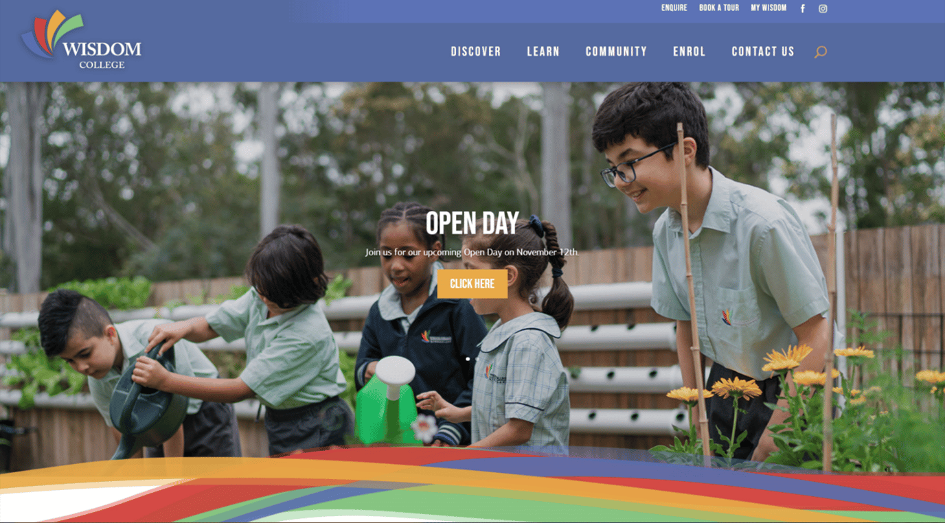
In full disclosure, Wisdom College’s website was designed by the Roberts Digital team.
Wisdom College is a Prep to Year 12 College in Calamvale, Brisbane. Wisdom College is a small but growing multi-cultural, non-denominational college committed to promoting the school’s humanity.
What I loved: One thing I really like about the Wisdom College website is its effective use of a range of colours. Unlike most sites that stick strongly to 2-3 brand colours, the Wisdom site is vibrant and effectively uses a wide range of colours throughout its design. It can be said that Wisdom’s vibrant and fun branding has effectively been implemented throughout the site. In addition, something else I love about the site are the consistent and strong calls-to-action, especially in the two-tiered menu.
Mobile Friendly: Yes
Barker College
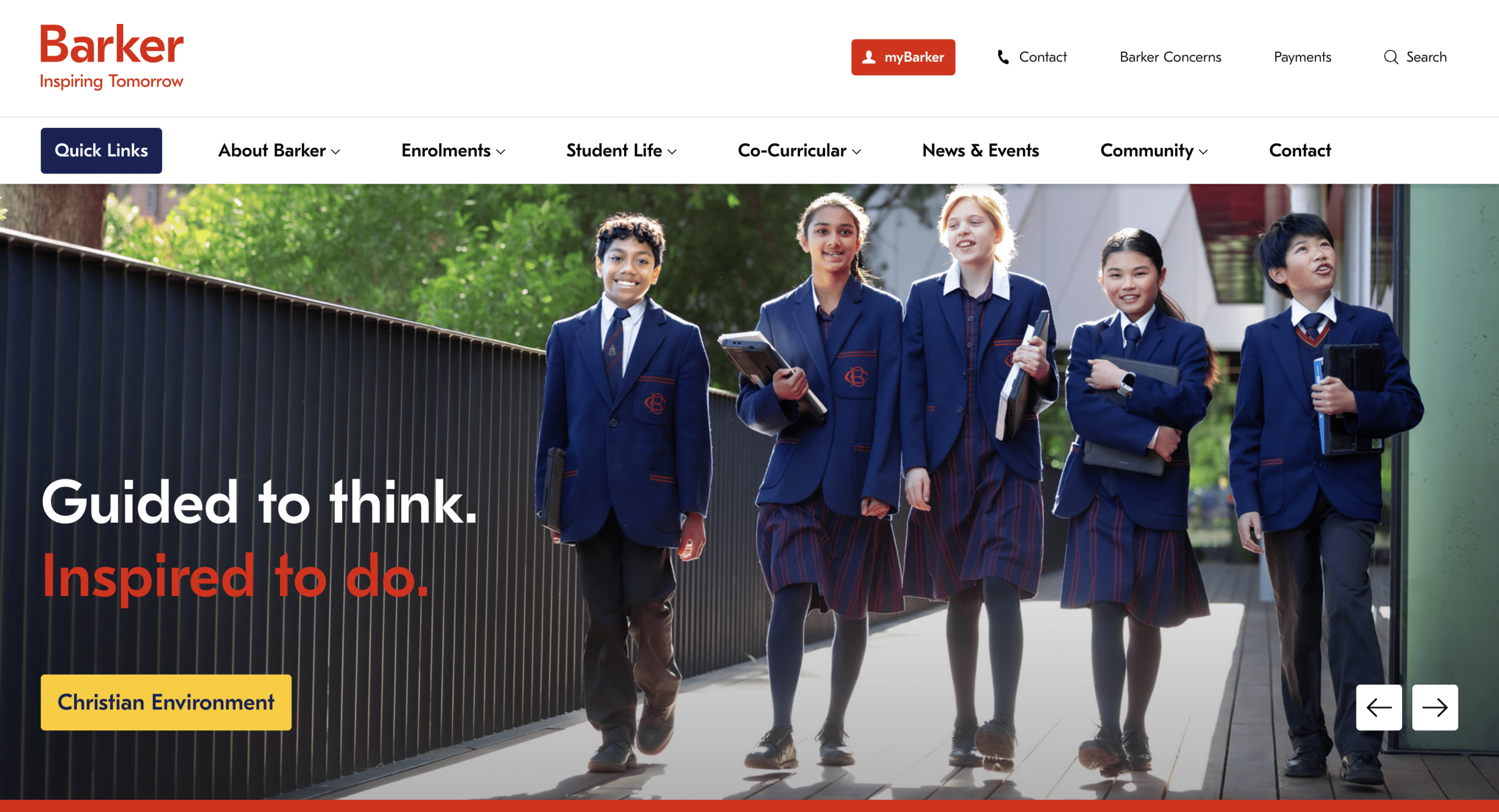
URL: www.barker.college
Barker College is an Early Learning, Primary and Secondary co-educational day and boarding school based on the North Shore of Sydney. The school is founded on Anglican traditions and welcomes students from all traditions into their culture. Barker is known for its wide variety of student opportunities within a magnificent campus and learning environment.
What I loved: The shots of students throughout the site depicts the wide variety of opportunities students can participate in. I also love the creative placement of photographs through the site. The navigation is easy to use and generally you can find pages where you would expect to. Overall, I love the colour and creativity of the website.
The virtual tour videos are well done and give you a great feel for the College prior to visiting the school.
Mobile friendly: Yes
KNOX Grammar School
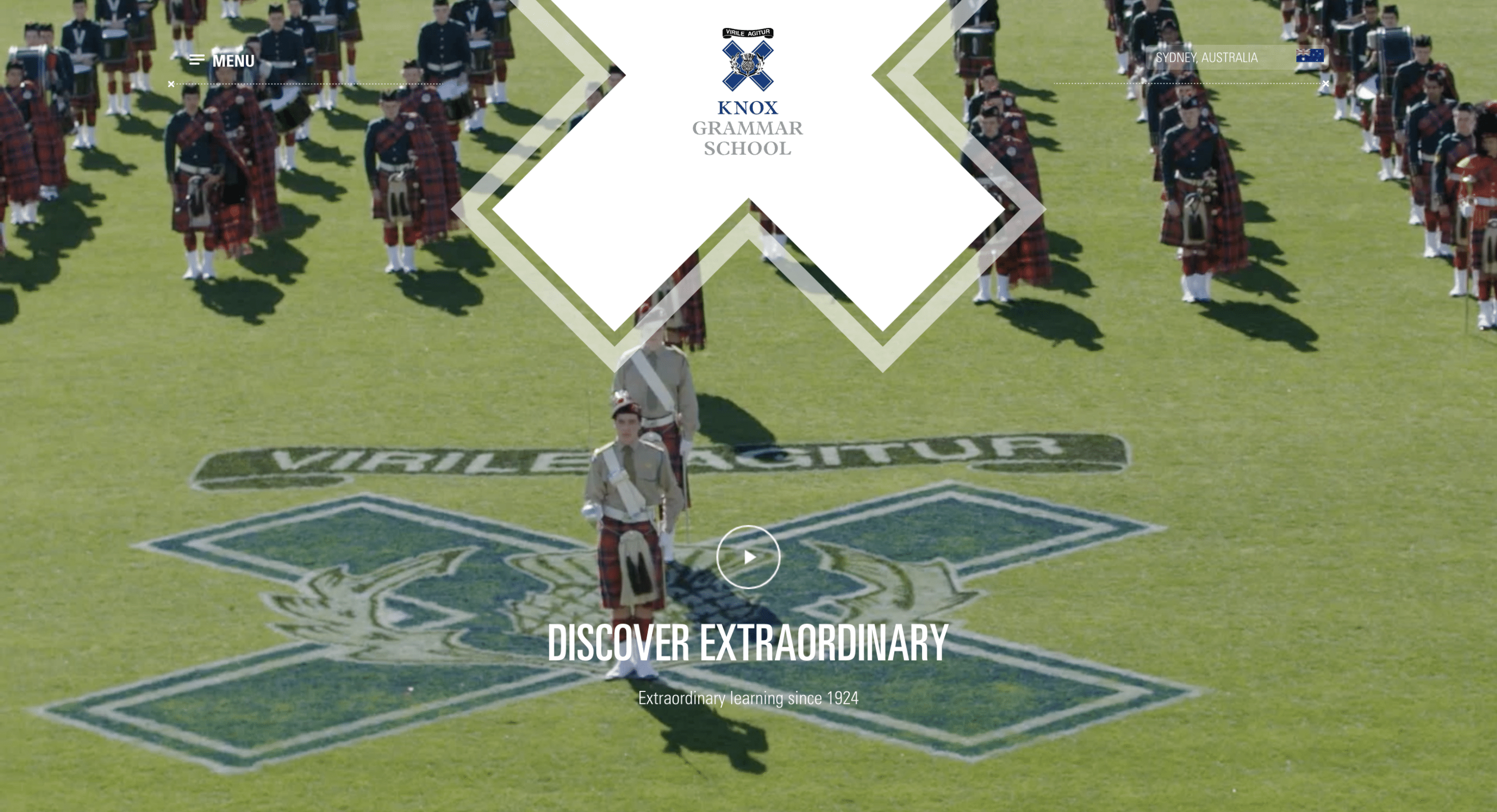
URL: www.knox.nsw.edu.au
Knox Grammar, named after John Knox, is a day and boarding school for boys with two campuses located in Wahroonga and the competitive area of Sydney’s Upper North Shore. Knox boasts excellent results as a top performing, non-selective school and was founded in 1924 by the Presbyterian Church of Australia.
What I loved: The central X on their home page header. The fun and engaging photography and videography style throughout their website. The image gallery navigation on the home page is well done, contrasting students with staff below. I also love the ‘What’s happening at Knox’ section on the home page as it is a clean and well structured way to have College updates front and centre.
Mobile friendly: Yes
Considerations for improvement: a simplified mega-menu structure.
Mentone Girls’ Grammar
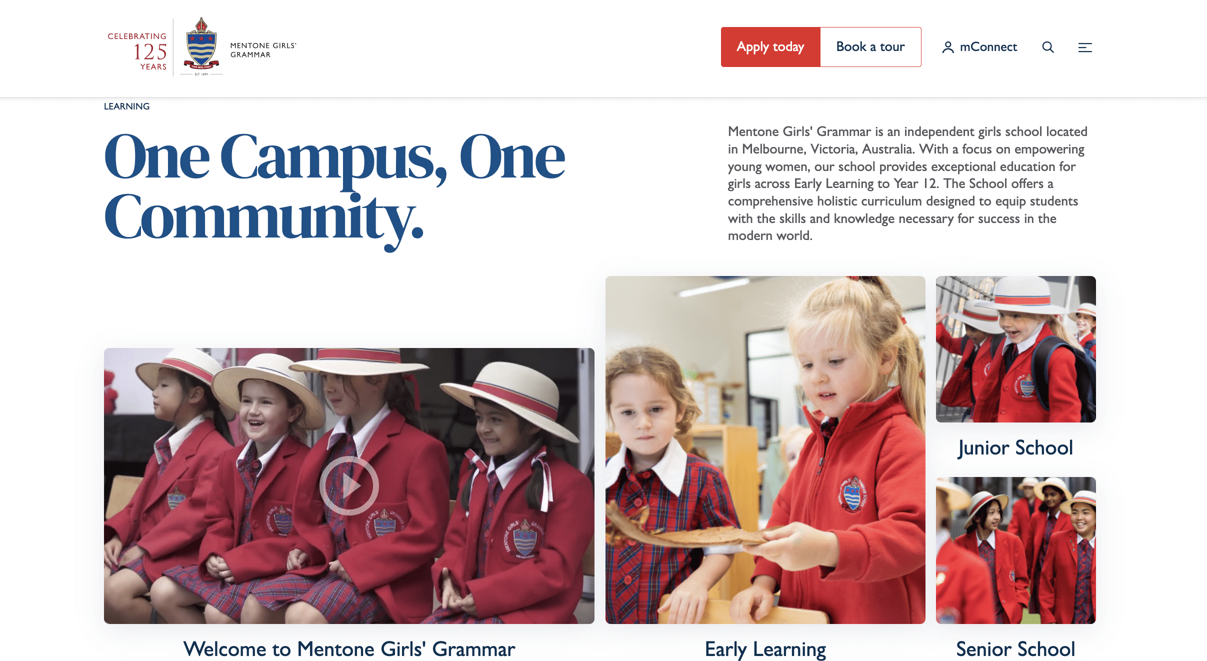
URL: www.mentonegirls.vic.edu.au
Based in Mentone (a bayside suburb of Melbourne), Mentone Girls’ Grammar is an independent, Anglican day school for girls. Mentone Girls’ Grammar school was founded in 1899 and caters for over 700 girls from Early Learning to Year 12.
In 2014 Mentone Girls’ Grammar School became the first school in the world to receive the Certificate of International Education with the Council of International Schools.
What I loved: The bright red brand colour makes for an impactful website that stands out. I love the unique look and layout for a school website and the photography used. The header section is also unique and an effective way to highlight content without the use of a slider.
Mobile friendly: Yes
Belmont Christian College
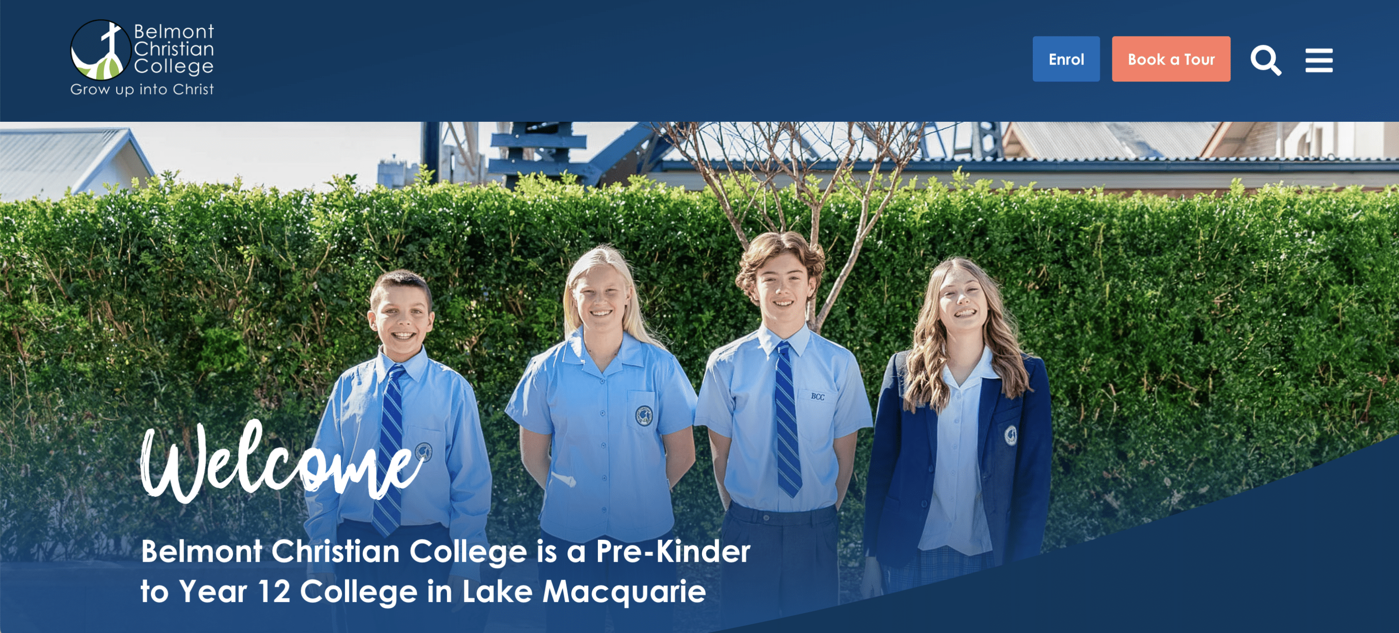
URL: bcc.nsw.edu.au
Founded in 1982, Belmont Christian College has grown from a school of 12 to a Pre-Kindergarten to Year 12 College. Based in Lake Macquarie, New South Wales, the College is providing a solid educational foundation and a variety of learning opportunities for their students.
What I loved: The purpose of the College is evident right from the home page with their vision and mission visible for all to see. Standout facts about the College are presented on the home page using storytelling, and links for prospective parents to book a school tour and enrol are clearly visible. I love the creativity used in the design, the bright bold photographs, and the use of curved lines to reinforce their brand feel.
Mobile friendly: Yes
Considerations for improvement: Clearer call-to-action.
Pedare Christian College
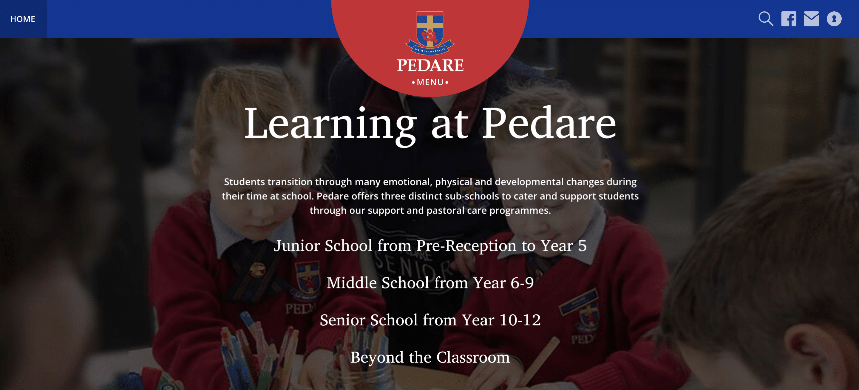
Based in Adelaide, Pedare Christian College is a coeducational Anglican and Uniting Church school offering quality education from Pre-Reception to Year 12. Pedare enjoys a diverse and multicultural school community and is internationally accredited as an International Baccalaureate Middle Years Program and Primary Years Program school.
What I loved: I must have a thing for red and blue because this is another school website design that I love. The contrast created with the red and blue corporate colours results in a striking school website design. Additionally, the unique layout of the school categories (Primary, Middle and Senior) is refreshing and looks great! I am also a fan of the circle logo in the middle of the site.
Mobile friendly: Yes
Considerations for improvement: Some of the site elements feel unfinished.
St John’s Anglican College
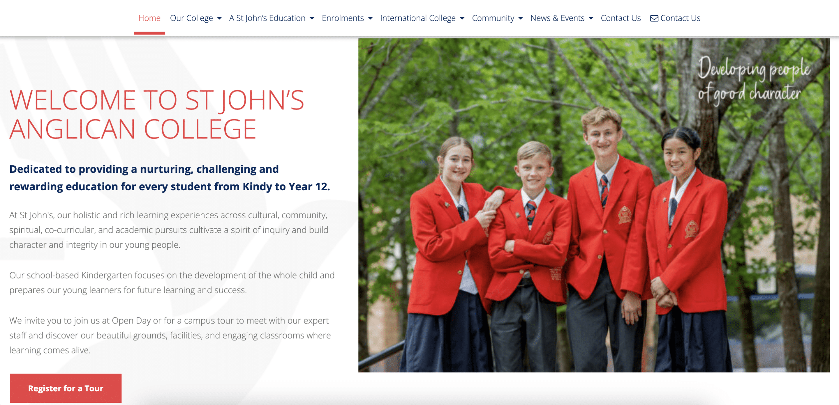
URL: stjohnsanglicancollege.com.au
A leading Kindergarten to Year 12 co-educational school, St John’s Anglican College is based in Forest Lake, Queensland. The school commenced in 1994 and was formerly known as Forest Lake College until 2011. The College prides itself on ‘Faith, Service and Courage’.
What I loved: Overall, the design is visually appealing with clean content sections. I love the icon watermark and highlighted content sections. They have used their two brand colours effectively with red headlines and blue sub-headings. I love the prominent placement of the Principal on the home page (a photo of her with students) and the invitation to learn more about her. This could be done more on school websites. They clearly highlight their enrolments section with a tour booking link in an easy to find location for prospective parents.
Mobile friendly: Yes, very visually appealing on mobile too!
Considerations for improvement: The navigation font could be made one or two points smaller and tightened up a bit.
Cabra Dominican College
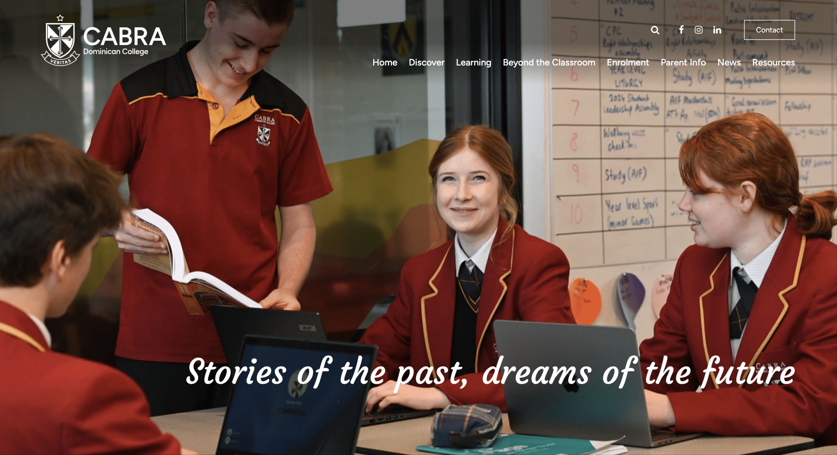
URL: www.cabra.catholic.edu.au
Based in Adelaide, Cabra Dominican College is a private, independent Catholic College that began in 1886. Cabra is co-educational for Years 7 to 12 students with a focus on excellence in teaching and learning while supporting their teachers and students.
What I loved: The simplicity and clean design of this school website is pulled off with a sophisticated finish. The font, spacing and placement of images is all done in a way that is pleasing to the eye and results in a website that is functional, uncomplicated and effective. A small detail that I love is the fact that their contact details are so accessible with a button on the top right.
Mobile friendly: Yes
Considerations for improvement: Some of the text over images is not readable.
AGC Sunderland
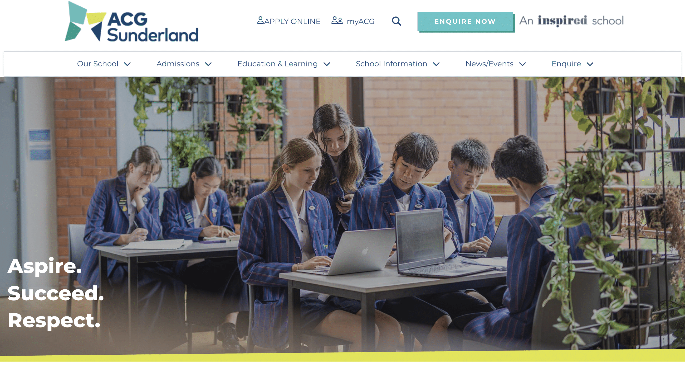
Founded in 2007, AGC Sunderland is located in Auckland, New Zealand. A private school from Preschool to Year 13, this coeducational school offers a wide variety of academic and co-curricular opportunities for its students to pursue.
In 2019, AGC Sunderland achieved 100% A Level pass rate and were awarded top in Chemistry, Physical Education, Mathematics and English.
What I loved: I am actually a big fan of the effective use of white space in school website design. I love the use of standout colours contrast with white space that results in a beautiful finish. ACG Sunderland’s unique brand look has been skilfully implemented on their website with the use of unique shapes and angles. The school also has well placed calls-to-action throughout the website.
Mobile friendly: Yes
Considerations for improvement: The navigation could be tightened up.
St Margaret’s Anglican Girls School
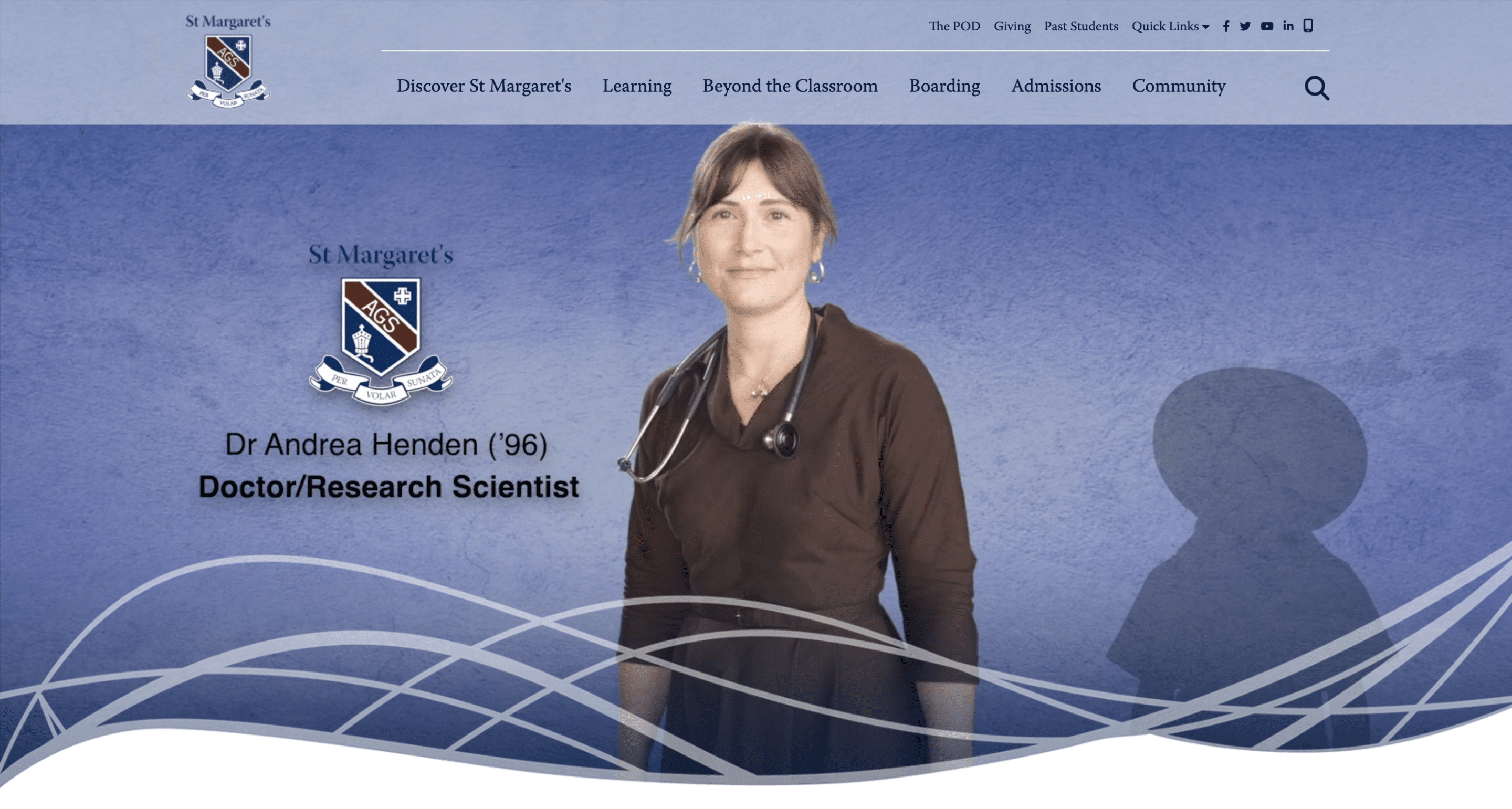
URL: https://www.stmargarets.qld.edu.au
St Margaret’s Anglican Girls school is a day and boarding school for girls from Pre-Prep to Year 12. Located in a competitive area in the inner-northern suburbs of Brisbane, St Margaret’s has a fine reputation of ranking as one of Queensland’s top schools.
What I loved: The stunning header video so succinctly communicates their rich history contrast with their leadership in today’s world. The home page is uncluttered with a clear focus on attracting prospective parents with well placed calls-to-action. I feel they have successfully engaged both prospective parents and current parents with a well-structured site.
Mobile friendly: Yes
Considerations for improvement: They may want to introduce a second corporate colour to their school website design to better highlight calls-to-action.
Questions regarding this article? Please email me at mara@robertsdigital.com.au


